The Recipe feature on the existing Grocery Shopping app InstaCart, allows you to shop and plan by your favorite recipes to have them delivered to your door.
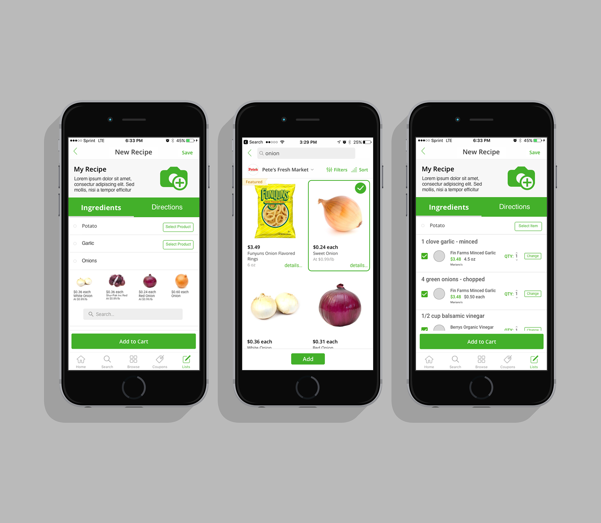
Problem: A person can either do their grocery shopping online or have recipe subscription boxes. When online grocery shopping for their favorite recipe they would need to add each item individually to the grocery app's cart.
What if your favorite grocery shopping app allows you to shop by your favorite recipes, save them, and discover your own?
Project: Recipe feature is for online grocery shoppers that like to create their grocery list by planning what they wish to cook and prepare.
The project was created for our Capstone project, as part as a three person team. We all divided tasks equally during analysis so we each participated in the research. For the prototype and design we divided our work by different parts of the app feature. My focus was on the experience of exploring and creating recipes.
We used InstaCart (an existing grocery shopping app) as a base, this allowed us to focus just on the shop by recipe experience, since we our time frame was the class’ term.
User Interviews
We conducted interviews with target users to learn about their grocery shopping habits. In this interview we set to learn:
• if users shop by recipe
• which methods they use to grocery shop
• how often they grocery shop
• if they use shopping lists
• use or have used recipe subscription boxes, and their experience with it
We found that all participants shopped planning for the near future, and considering what meals they were planning to prepare. Four of our participants followed strict recipes, while the other two just made dishes depending on the ingredients they had. Generally participants indicated they shopped by “low inventory” method. They would purchase items they were running low on or needed for a recipe they wished to prepare soon.
Walkthrough
Since most participants shopped by recipe, we decided to conduct a walkthrough of shopping by a specific recipe, we provided, on the app InstaCart. This unveiled what we already hypothesized, that the process was tedious and time consuming, specifically if each time the user wished to shop the recipe they had to go through it all over again and took into consideration any groceries they had at home.
Personas
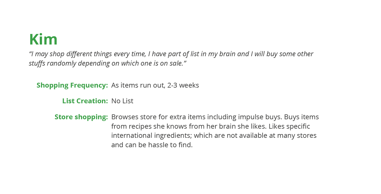
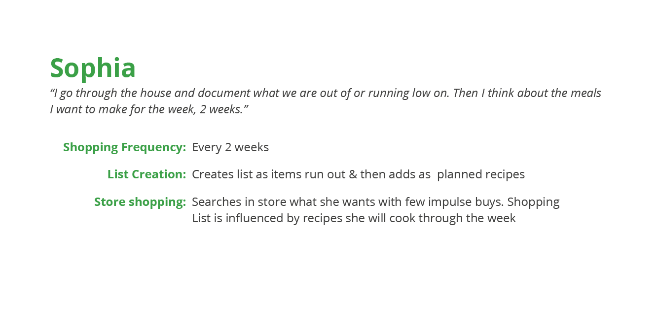
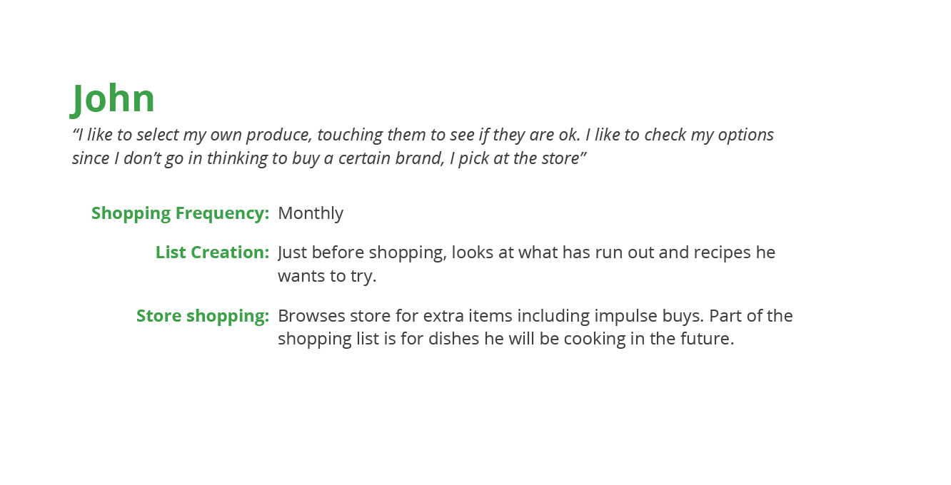
Based on our results of User Interviews and Walkthroughs, we created three personas.
User Flow
From our User Interviews and Walkthroughs we created a diagram flow that users would follow when shopping by recipe. We would use this diagram to create our initial Paper Prototype.
Paper Prototype and Pluralistic Usability Walkthrough
We created a paper prototype from our User Flow, each node represents a screen. The paper prototype used InstaCart as a base, since we planned on using it as a base on our high fidelity prototype. We printed our screens and conducted a Pluralistic Usability Walkthrough where we asked users to Think Aloud as they attempted to shop by a specific recipe. The task was very similar to our initial Walkthrough, but instead of the existing app, this time it was with our Paper Prototype that we created screens for recipe building.
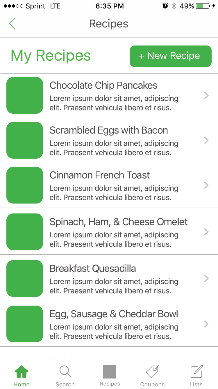
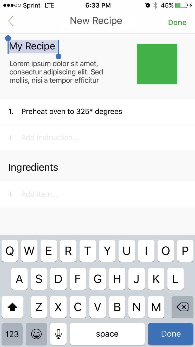
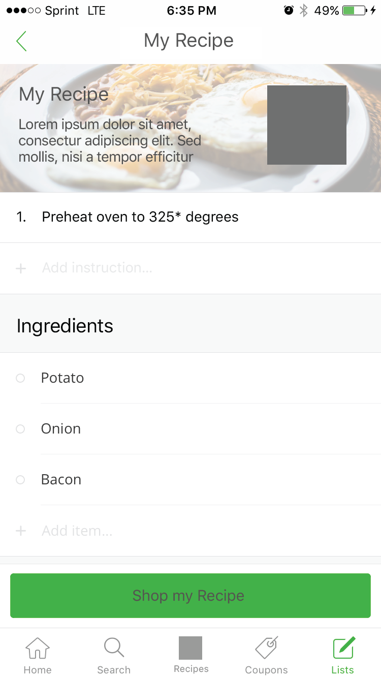
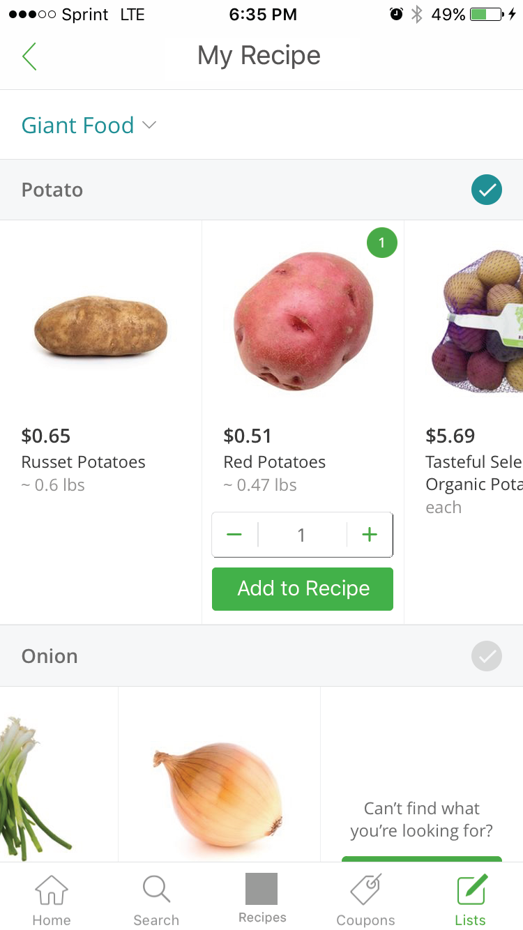
New Recipe experience for Paper Prototype
We found that:
• The navigation between recipes was confusing because we had existing recipes as well as the option to create your own. We decided to eliminate the existing recipes from the design.
• The “Shop my recipe” caused confusion and decided to change to “Add to Cart”.
• The existing recipe order was confusing and we need to state ingredients first.
• Users were able to use the “swap item” without any obstacles, yet renaming to “Change” would be even more intuitive.
• We found we needed to add a way to remove certain items from recipes when adding or in cart.
With this feedback we edited our screen designs and refined them to be higher fidelity.
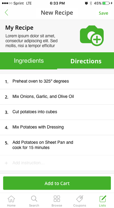
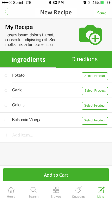
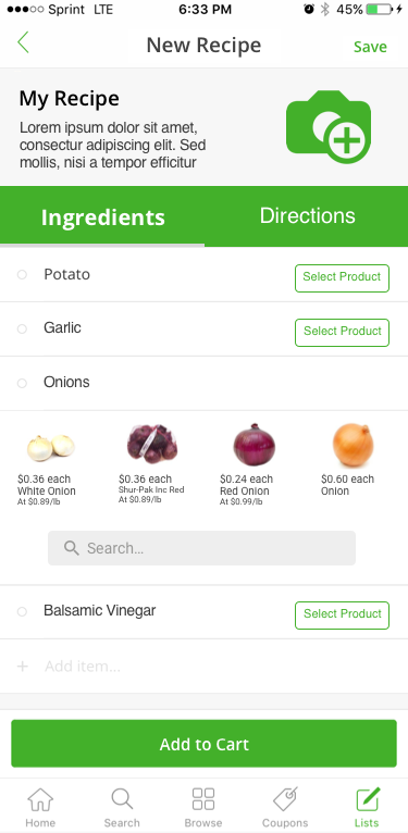

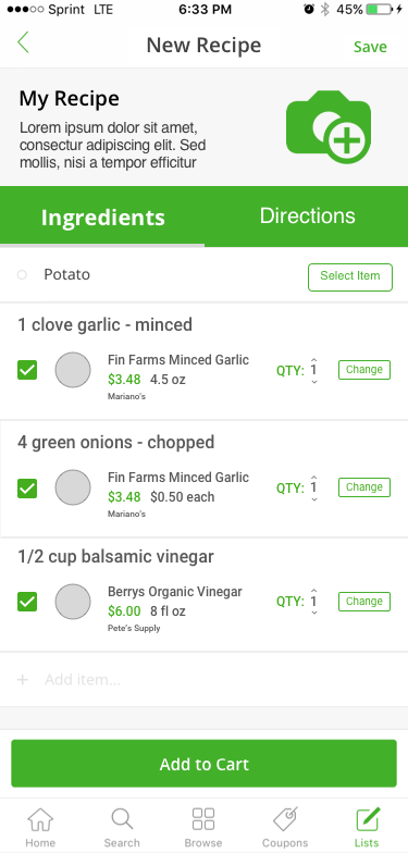
Interactive Prototype for Recipe Experience
Interactive Prototypes and Usability Testing
Using data gathered from the Pluralistic Usability Walkthrough from our Paper Prototypes we created an improved High Fidelity version of our prototypes. We utilized InVision to create a web-based functional prototype. Participants navigated through the screens with designated hotspots that triggered appropriate screens. This allowed the participants to use their phone for a more realistic interaction.
Just like our previous testing, we had similar tasks, now adding a more defined process of creating the recipe, and then adding to cart, and finally removing any items they already had.
We found that:
• Users had difficulty understanding how to change the quantity of an item in a recipe.
• When a user added an item to the recipe, recommended products and a search bar appears. This search bar was confusing, we decided on a “More” button, was a better option.
• Due to having a more restricted path, the task user flow did not navigate as smoothly as our paper prototypes.
• Due to mixing basic screens from InstaCart and ours, there was not a seamless transition.
Conclusion
We intended to discover if users of grocery delivery apps would like and use a shop by recipe experience. With our work, users positively responded to the idea of being able to shop by a recipe versus item by item. Since our project was tied to a class term, we were not able to create an additional iteration with final changes. With an extra iteration we believe we could have added the latest findings and create a seamless Recipe feature for a grocery app.