DermaE’s mobile website experience was created for the Mobile Design Class’ final project. The project idea was inspired by realizing that their existing mobile website experience could use improvement and needed to match their desktop experience. The main content and experience was analyzed and then reorganized to create paper wireframes to explore different design options. To further develop the design ideas, digital low fidelity wireframes were designed. Finally, high fidelity prototype screens were created using Sketch and then InVision was used to integrate the transitions and interactions.
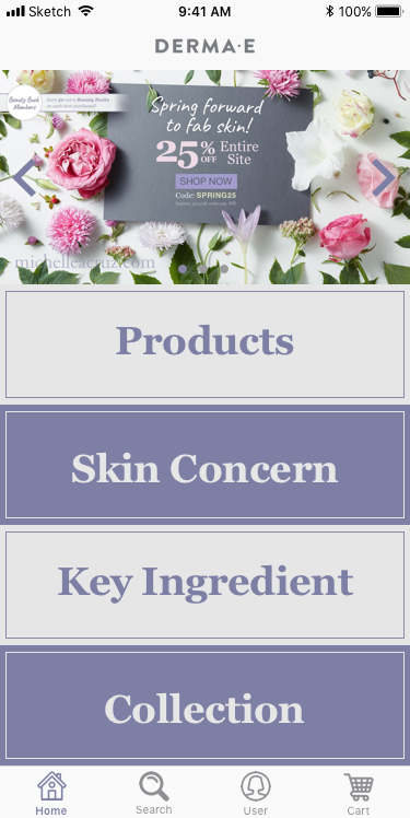
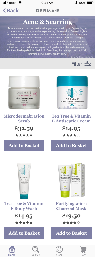
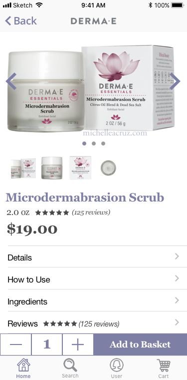
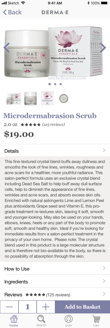
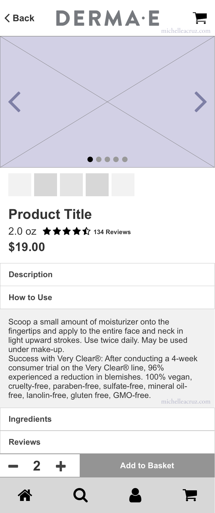
In the Derma E's mobile website prototype the user explores and finds a specific product. The process flow created allows the user to navigate the homepage by clicking on the category tiles, which open up and display the subcategories. When a subcategory is selected, it opens up a page to browse products, if needed the user can filter down further via various categories. Finally the user can select a product where they can see more information by clicking on the different headers.


InVision Prototype: https://invis.io/HCGADSUMZDG
